
Accessibility-First Booking Experiences: WCAG 2.2 + ADA Guidance for Studio Websites and Apps
WCAG 2.2 booking accessibility is the foundation of a smooth and inclusive studio booking experience. Members leave when they struggle to choose a class, complete checkout, or access their dashboard. When booking works well for people with disabilities, it works better for everyone.
Today, most studio clients book from their mobile devices. They tap small screens and enlarge text to read clearly. Some rely on screen readers or voice controls instead of a mouse. If your website or app does not support these users, you risk losing customer trust and potential revenue.
Studios that operate with Cloud Studio Manager software use their platform to automate processes while managing member activities. All users must be able to use automation systems. The World Wide Web Consortium publishes the WCAG standards, and the Americans with Disabilities Act requires businesses to provide accessible services. This guide explains how to apply WCAG 2.2 booking accessibility standards to calendars, forms, checkout flows, and member portals.
Why Accessibility Is a Growth Lever (Not Just Compliance)

Many studios think accessibility is only about legal compliance. In reality, it goes far beyond that. Accessibility improves usability, builds trust, and strengthens your brand. It also gives your studio a competitive advantage.
When booking becomes user-friendly:
- More visitors complete their purchase
- Fewer members call for help.
- Mobile users stay longer.
- Reviews improve.
ADA web accessibility fitness studio practices demonstrate that a fitness business operates its facilities to accommodate all people. The studio provides access to all people, including seniors, parents, veterans, and individuals with vision or mobility challenges.
Accessible booking creates a smooth experience. When members struggle to select a class or complete checkout, frustration builds quickly. Even small barriers can cause them to leave before finishing their booking. The implementation of WCAG 2.2 booking accessibility standards leads to decreased user drop-off rates and increased user conversion rates.
WCAG 2.2: What Changed and Why It Matters
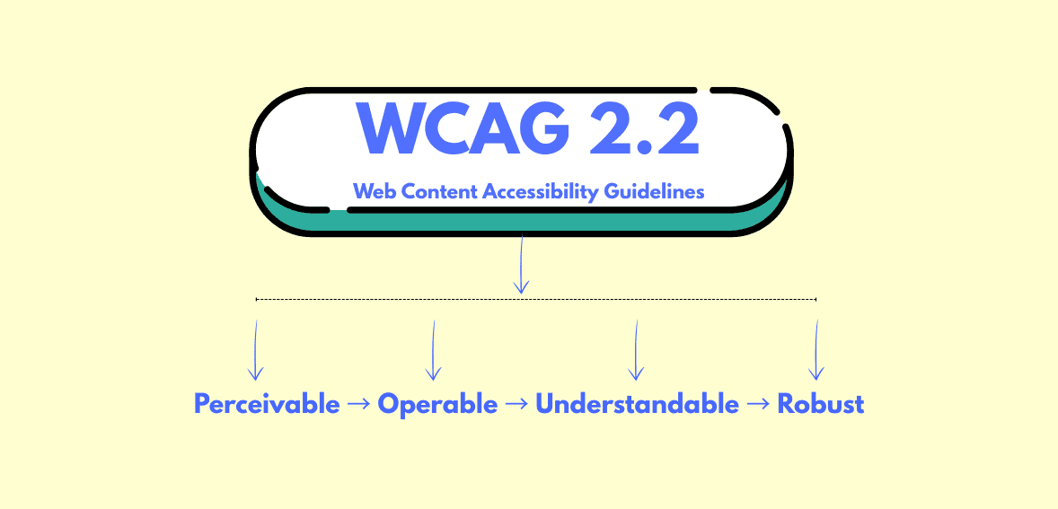
The World Wide Web Consortium published WCAG 2.2 as an official web standard in 2023. The standard improves usability through new success criteria that build upon previous versions.
The updates focus on:
- Clear focus indicators
- Better support for dragging alternatives
- Improved accessible authentication
- Stronger help for users with cognitive challenges
The changes are important because booking systems depend on their small buttons, date pickers, and multi-step checkout pages. Users become disoriented when they cannot see which element has been selected. Some users cannot log in because they need to solve complicated authentication puzzles.
Fitness studios can create mobile-friendly booking systems through WCAG 2.2 booking accessibility design, which requires them to develop simple, predictable booking processes. The ADA specifies no exact technical requirement, but WCAG serves as the general standard for American accessibility requirements.
Booking UI Pitfalls: Calendars, Time Pickers, Seat Maps
Booking tools often create the biggest accessibility challenges on studio websites.
Calendars
Most online calendars require mouse-based navigation. Keyboard users cannot move between dates. Screen readers may not announce which date is selected.
An accessible calendar should allow users to move between dates using arrow keys. Each date must have a clear label so screen readers can announce it properly. Available time slots should be clearly marked, and the current focus must always be visible on the screen.
If users must click with a mouse to choose a date, the calendar does not meet WCAG 2.2 accessibility standards.
Time Pickers
Time selection can also create confusion for users. Dropdowns and sliders must include clear labels that explain their purpose. A screen reader should announce “6:00 PM class available” instead of simply saying “button,” so users understand what they are selecting.
Mobile booking systems improve accessibility by using large touch targets and proper spacing. Small buttons make booking difficult on mobile devices.
Seat Maps or Spot Selection
Workshops and special events may create visual seat maps. Visual seat maps should include text alternatives. Users must be able to see how many spots remain and which spot they have selected, even if they cannot rely on the visual layout.
Icons alone are not enough. Text must support the visual layout.
Forms and Checkout: Labels, Errors, Focus States
Members use forms to provide their personal information, together with their payment information. This is where many booking journeys fail.
Every field must have a visible label. The box requires more than placeholder text to meet accessibility standards. Screen readers need proper labels connected to each input.
The main problems that people face include
- Missing labels
- Confusing error messages
- Focus sometimes jumps unexpectedly between elements.
- The error message disappears after some time.
WCAG 2.2 booking accessibility requires clear error identification. If the card number is incorrect, the user should see a clear explanation with instructions on how to fix it.
Focus order must follow a logical path. Users should move through the form in a sequential manner when they press the Tab key.
The improvements enable users to complete their checkout process while achieving the accessibility checklist member portal standards.
Color Contrast and Movement Requirements
Design elements create hidden obstacles that users do not see.
Text must have a strong contrast against its background so it remains readable for users with low vision. The combination of light gray text and a white background presents a modern appearance, yet it creates reading difficulties for many users.
Users need more than color to understand information. Users who see red error indications will not identify the problem. Add text like “Error: Please enter a valid email.”
The aspect of motion requires consideration. Users become distracted by fast animations and flashing banners. Certain types of motion can result in health problems.
Accessible mobile booking UX requires three elements, which include stable screens, readable text, and calm design.
Testing Workflow: Keyboard-Only and Screen Reader Smoke Tests

Testing does not need to be complex.
First, unplug your mouse. Use only the keyboard. Press the Tab key to move through the entire booking flow from start to finish. Can you select a class? Can you enter payment details? Can you submit the form?
Second, turn on a screen reader. On Windows, use Narrator. On Mac, use VoiceOver. Listen carefully. Are the labels understandable? Do the buttons have complete descriptions?
Third, use automated tools to scan for contrast and missing labels. The tools help with detection work, but they do not identify all existing problems.
Fix the issues that block booking first. Then move to smaller improvements. Every update must follow the access standards of WCAG 2.2 for booking systems.
Accessibility Statements and Ongoing Governance
Accessibility is not a one-time task. It requires ongoing attention.
Studios need to create an accessibility statement that shows their compliance with the following elements:
The standard followed, such as WCAG 2.2
The existing limitations that they have identified
The contact information that users need to reach them
The U.S. General Services Administration recommends documenting accessibility processes and maintaining transparency.
Testing needs to be conducted again whenever features undergo modifications. The review process should evaluate new booking tools that have been integrated into the system. The accessibility checklist member portal should become a standard procedure for maintaining the website.
Roadmap: Fixes by Impact and Effort
Start with high-impact fixes that require little effort.
- High impact, low effort:
- Add proper form labels.
- Improve text contrast.
- Fix tab order.
- Add visible focus outlines.
Medium effort:
- Replace inaccessible date pickers.
- Improve mobile spacing.
- Clarify error messages.
Larger effort:
- Redesign complex booking widgets.
- Rebuild custom dashboards.
Start with the barriers that stop members from completing a reservation. Every improvement should align with WCAG 2.2 accessibility standards for booking.
Conclusion
WCAG 2.2 booking accessibility standards help studios build booking systems that are simple, transparent, and inclusive. The booking process becomes easier for users when keyboard-compatible calendars, error-explaining form elements, and mobile-friendly checkout methods work together.
Accessibility builds trust. It makes booking easier to use. It also supports long-term business growth.
Studios that invest in accessible booking experiences create a welcoming space for every member. The dedication to this cause helps both the community and the business achieve their goals.
FAQs
Is WCAG 2.2 official?
Yes. The World Wide Web Consortium has published WCAG 2.2 as an official web standard, which serves as a global accessibility benchmark.
Does the ADA require WCAG?
The ADA requires that services be accessible to users because it does not specify any particular technical requirement. The United States uses WCAG as the official standard for accessibility testing.
What breaks booking flows most often?
The most common problems arise from three factors: unlabeled fields, poor focus order, and inaccessible date and time pickers. Users face these barriers, which prevent them from completing their bookings.
How do we test quickly?
The testing process requires keyboard-only navigation, screen reader spot checks, and automated scans. Begin with the most critical issues that need resolution.
What should we document?
The accessibility standard you use should be documented, together with all existing limitations, and your contact information should be included. You should revise your statement whenever new features are implemented.